


-
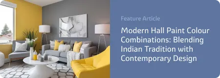
Living Room Colour Ideas
All Living Room Inspirations Blue Living Rooms Brown Living Rooms Grey Living Rooms Green Living Rooms Orange Living Rooms Purple Living Rooms Pink Living Rooms Red Living Rooms Yellow Living Rooms White Living Rooms
-
Bedroom Colour Ideas
All Bedrooms Inspirations Blue Bedrooms Brown Bedrooms Grey Bedrooms Green Bedrooms Orange Bedrooms Purple Bedrooms Pink Bedrooms Red Bedrooms Yellow Bedrooms White Bedrooms


Light, and Life to India's Homes.
At JSW Paints, we believe true beauty is not just about looking good, but about thinking and doing good.
thoughtful is beautiful.
That is why we have infused thoughtfulness in every drop and detail.
How to Use Bold Accent Colours Without Overwhelming a Space
Adding bold accent colours to your space can bring energy, personality, and visual interest to a room. However, using them without making the space feel overwhelming requires balance and thoughtful design. Here’s how you can successfully incorporate bold colours while maintaining harmony and sophistication.
1. Choose a Primary Neutral Base
The key to making bold accent colours work is to ground them with a neutral foundation. A neutral base, such as white, grey, beige, or taupe, creates a backdrop that allows your accent colours to pop without competing for attention. This ensures that the space doesn’t feel chaotic or visually cluttered.
Example Colour Combinations:
- Walls:Soft grey or crisp white
- Accents:Deep emerald green or mustard yellow
- Furniture & Decor:Natural wood, black metal, or subtle patterns to tie it together
2. Stick to the 60-30-10 Rule
Interior designers often follow the 60-30-10 rule to maintain a well-balanced colour scheme:
- 60% of the room should be a dominant neutral colour (walls, large furniture pieces).
- 30% should be a secondary colour that complements the base (sofas, curtains, rugs).
- 10% should be a bold accent colour (throw pillows, artwork, decorative accessories).
3. Use Bold Colours in Small Doses
If you love bright colours but worry about overwhelming a space, start with small pops of bold hues. This approach allows you to test how a colour feels in a room before committing to larger elements.
Ways to Introduce Small Pops of Colour:
- Throw pillows and blankets
- Area rugs with vibrant patterns
- Artwork and wall decor
- Decorative vases, lamps, or trays
- Chair cushions or table runners
For example, if your living room is primarily neutral, adding cobalt blue cushions and a statement vase can create a striking yet balanced contrast.
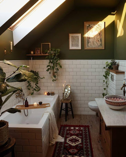
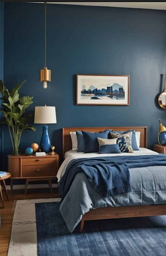
4. Consider an Accent Wall
An accent wall is a fantastic way to introduce a bold colour without overwhelming the entire space. Choose one wall to paint in a dramatic shade while keeping the other walls neutral. This technique draws attention to a focal point without making the room feel enclosed or heavy.
Best Rooms for an Accent Wall:
- Living room: Behind the sofa or TV unit
- Bedroom: The wall behind the bed’s headboard
- Dining room: A bold backdrop for a dining table
Popular accent colours include deep navy blue, (terracotta horses- 3137) , rich emerald green, or even a burnt orange for a warm and inviting feel
5. Balance with Natural Elements
To soften the intensity of bold colours, incorporate natural materials and textures. Wood, rattan, stone, and greenery help create a more organic and inviting atmosphere.
How to Pair Natural Elements with Bold Colours:
- Combine a burnt orange accent wall with wooden furniture and woven baskets.
- Pair deep blue decor with indoor plants and linen textiles
- Add mustard yellow pillows to a neutral room with a jute rug and wooden coffee table.
- This balance prevents the space from feeling too stark or overwhelming.
6. Experiment with Monochromatic and Analogous Schemes
If you love bold colours but want to keep things cohesive, consider using a monochromatic or analogous colour scheme.
- Monochromatic:Use different shades of the same colour. For example, a teal feature wall with lighter turquoise and mint accessories.
- Analogous:Choose colours next to each other on the colour wheel, such as blue, green, and teal, for a harmonious yet vibrant look.
7. Pay Attention to Lighting
Lighting plays a crucial role in how colours appear in a room. Bold hues can feel overpowering in spaces with little natural light but look stunning in well-lit areas.
Tips for Using Lighting to Your Advantage:
- Use warm lighting to soften rich colours like deep red or forest green.
- Position mirrors to reflect light and keep bold colours from making a room feel smaller.
- Layer different light sources (overhead, floor lamps, table lamps) to distribute light evenly.
8. Maintain Cohesion Throughout Your Home
While you may want to use different accent colours in various rooms, maintaining a sense of cohesion is essential. Choose a palette that flows naturally from one space to another, so your home feels connected rather than disjointed.
Examples of Colour Flow:
- A (Oxford Blue 5208) accent wall in the living room complemented by navy decor in the bedroom
- A mustard yellow throw blanket in the bedroom echoed in kitchen accessories
- Teal cushions in the living room paired with a teal accent chair in the office
- This strategy ensures that bold colours feel intentional rather than random
Final Thoughts
Bold accent colours can transform a space and add personality without overwhelming the design. By grounding them with neutrals, using them in small doses, balancing them with natural textures, and following smart design rules, you can achieve a vibrant yet harmonious look.