


-
Living Room Colour Ideas
All Living Room Inspirations Blue Living Rooms Brown Living Rooms Grey Living Rooms Green Living Rooms Orange Living Rooms Purple Living Rooms Pink Living Rooms Red Living Rooms Yellow Living Rooms White Living Rooms
-
Bedroom Colour Ideas
All Bedrooms Inspirations Blue Bedrooms Brown Bedrooms Grey Bedrooms Green Bedrooms Orange Bedrooms Purple Bedrooms Pink Bedrooms Red Bedrooms Yellow Bedrooms White Bedrooms


Light, and Life to India's Homes.
At JSW Paints, we believe true beauty is not just about looking good, but about thinking and doing good.
thoughtful is beautiful.
That is why we have infused thoughtfulness in every drop and detail.
Off-White Colour Combinations for Home and Office
Off-white is a smart choice for anyone who wants a versatile, neutral base that works well across all spaces, whether it's your home or office. But the trick to making off-white work isn't just about painting the walls. It's about pairing it with the right colours to set the right mood and get the right look.
Here are some off-white colour combinations that look balanced yet modern, in whichever space you’re designing, whether a living room or an office.
1. Off-White and Charcoal Grey
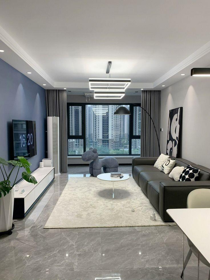
This pairing is a go-to for all modern professionals. Off-white walls (1031 Wisp of Vapor) create an open, airy base, while charcoal grey adds depth and seriousness. The contrast is subtle but striking and is perfect for spaces that need to feel functional and stylish.
- Where it works: Executive offices, study rooms, minimalist living rooms.
- Why it works: The grey anchors the space, while off-white keeps it from feeling heavy.
- Style tip: Accent with chrome finishes, matte black hardware, or glass décor for a polished, modern edge.
2. Off-White and Olive Green
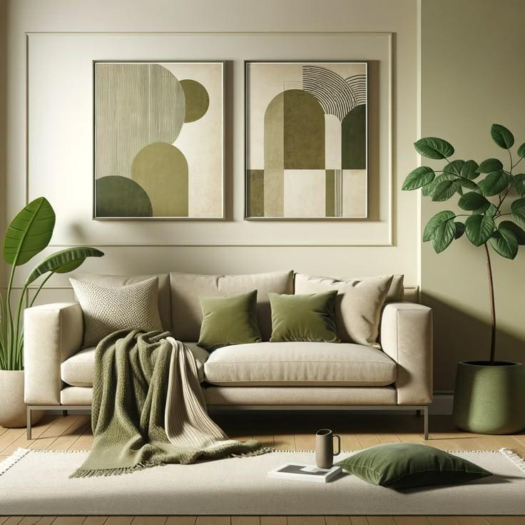
Olive green (3622 Ornate Limestone) brings an earthy, organic tone to off-white’s clean base. It’s calming without boredom, giving your space a subtle touch of nature.
- Where it works: Bedrooms, therapy or wellness rooms, creative studios.
- Why it works: Olive tones provide a grounded feel that promotes focus and relaxation.
- Style tip: Use natural textures like jute rugs, wooden shelves, and linen curtains to emphasise the earthy vibe.
3. Off-White and Navy Blue
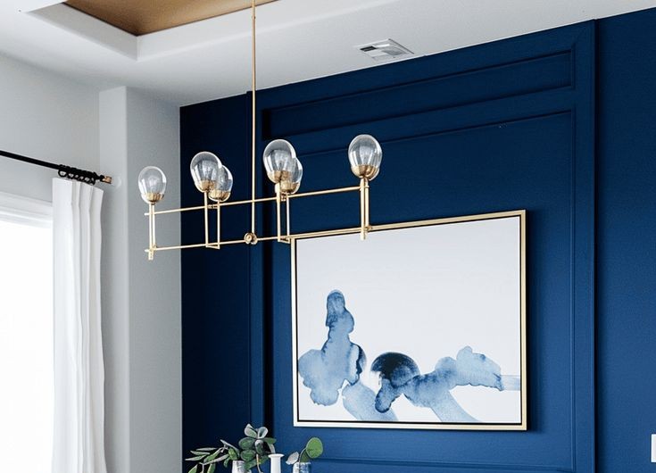
Navy blue (5206 Alright With Me) is deep, dependable, and dignified. When set against off-white, it creates a look that’s both classic and contemporary, structured yet light.
- Where it works: Boardrooms, formal dining rooms, and living spaces.
- Why it works: Off-white opens the space, while navy adds weight and visual interest.
- Style tip: Use brass or gold lighting fixtures and cabinet pulls to elevate the look with a touch of elegance.
4. Off-White and Blush Pink
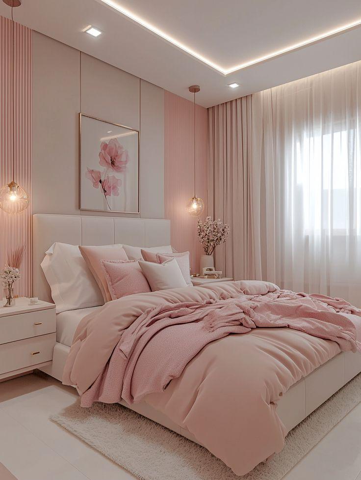
Blush pink (2225 Pink Bliss) adds a touch of warmth and charm to off-white without overpowering the room. It’s a gentle colour pairing that works well in both personal and public-facing spaces.
- Where it works: Reception areas, home offices, nurseries, boutique showrooms.
- Why it works: It’s friendly and fresh, ideal for creating a welcoming environment.
- Style tip: Choose layered textures, get velvet cushions or linen throws to add depth and get coziness.
5. Off-White and Mustard Yellow
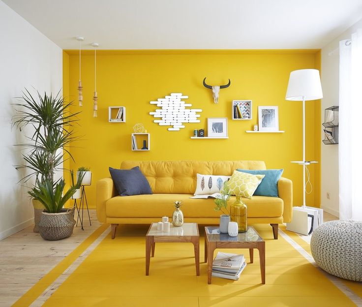
Mustard yellow (2048 Honeycomb Yellow) brings energy and personality, but it doesn’t feel too loud when paired with off-white. Instead, it looks curated and modern.
- Where it works: Creative agency offices, eclectic kitchens, lively living rooms.
- Why it works: Off-white balances mustard’s boldness, toning it down just enough.
- Style tip: Surround with natural neutrals such as wood, rattan, or beige so that mustard becomes your focal point.
6. Off-White and Black
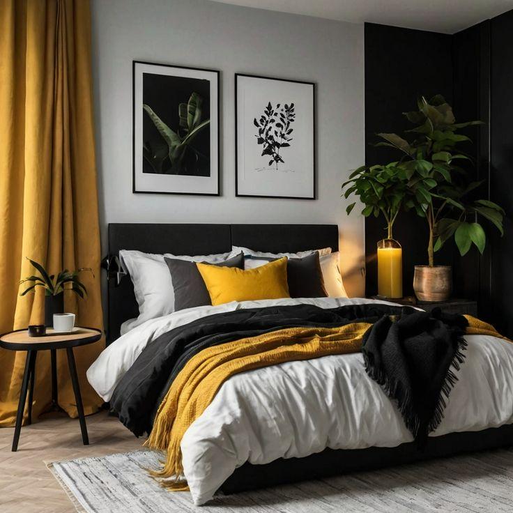
Few combinations are as sharp and striking as off-white (1192 Ritual White) and black. This high-contrast pairing gives you that clean, minimalist look that never goes out of style.
- Where it works: Modern offices, monochrome homes, bathrooms, and foyers.
- Why it works: The bold lines of black create structure; off-white prevents it from feeling stark.
- Style tip: Stick to clean lines and uncluttered spaces. This combo thrives on simplicity and negative space.
7. Off-White and Teal
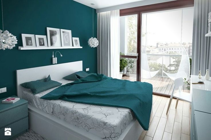
Teal (3415 Tea Plantation) introduces a fresh, energetic vibe without overpowering the calm off-white. It’s bold yet refined and a great way to add colour without making it too loud.
- Where it works: Meeting rooms, kids’ playrooms, stylish kitchens.
- Why it works: Teal adds personality, while off-white keeps it sophisticated.
- Style tip: Combine light wood finishes and matte textures to create a soft, modern look.
8. Off-White and Warm Wood
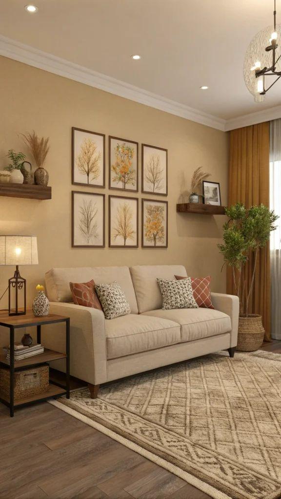
Wood and off-white are matches made in interior heaven. Whether oak, walnut, or pine, warm wood tones (3073 Burnished Glint) complement off-white beautifully, making a room feel timeless and grounded.
- Where it works: Living rooms, co-working spaces, open-plan homes.
- Why it works: The off-white brightens, the wood warms—creating balance and comfort.
- Style tip: Add soft neutrals like beige, taupe, or sand for a complete, layered aesthetic.
Conclusion
Whether designing a corporate office or a personal reading nook, off-white allows you to go bold, calm, modern, or traditional, depending on what you pair it with.
Use off-white as your foundation, and experiment with accents that suit your desired vibe. Start small with cushions, wall art, or a statement chair. Once you find your ideal combination, build from there.
Off-white isn't just neutral—it's intentional. And when paired right, it can turn any space into something memorable.