


-
Living Room Colour Ideas
All Living Room Inspirations Blue Living Rooms Brown Living Rooms Grey Living Rooms Green Living Rooms Orange Living Rooms Purple Living Rooms Pink Living Rooms Red Living Rooms Yellow Living Rooms White Living Rooms
-
Bedroom Colour Ideas
All Bedrooms Inspirations Blue Bedrooms Brown Bedrooms Grey Bedrooms Green Bedrooms Orange Bedrooms Purple Bedrooms Pink Bedrooms Red Bedrooms Yellow Bedrooms White Bedrooms


Light, and Life to India's Homes.
At JSW Paints, we believe true beauty is not just about looking good, but about thinking and doing good.
thoughtful is beautiful.
That is why we have infused thoughtfulness in every drop and detail.
Pastel Colour Shades Palette Ideas for Your Home
Pastel colours are making a powerful comeback in interior design, thanks to their soft, soothing tones that bring a sense of calm and sophistication to any space. These subtle shades—ranging from delicate pinks to muted blues—are perfect for creating a serene, airy atmosphere while adding a touch of elegance. Whether you're looking to revamp your bedroom, brighten your living room, or create a cozy nook, pastel palettes offer endless possibilities.
In this blog, we’ll explore five pastel colour palette ideas that can transform your home into tranquil retreat.
1. Soft Blush and Sage Green
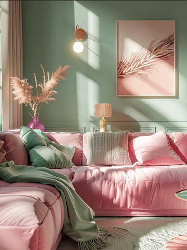
A combination of Pink of Health- 2185 and Sage Bouquet -2617 creates an effortlessly romantic and calming environment. The gentle blush exudes warmth and comfort, while the muted sage green introduces a touch of nature, fostering a balanced, peaceful ambiance.
Where to Use This Palette:
- Bedroom: Use blush pink on the walls to evoke a cozy, intimate feel, paired with sage green bedding or curtains for a harmonious look
- Living Room: Choose a sage green sofa against a blush accent wall, complemented by neutral furniture for a chic, contemporary vibe.
- Home Office: Blush pink enhances creativity, while sage green brings a sense of calm, making this palette ideal for a productive workspace.
2. Powder Blue and Cream
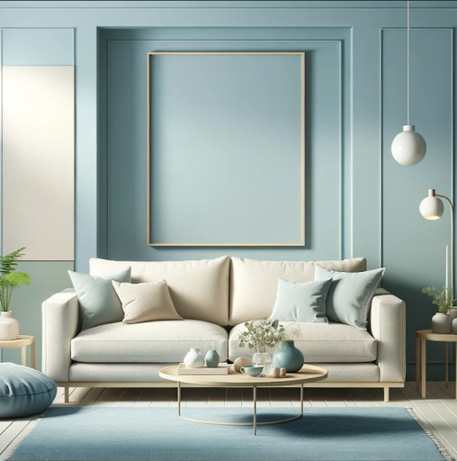
Nothing says tranquility like a palette of breeze blue - 4251 and sunshade cream- 1126. This soothing combination creates a light, airy atmosphere that feels inviting and spacious, perfect for smaller rooms or spaces where you want to feel more open.
Where to Use This Palette:
- Living Room: Paint the walls in powder blue to create a serene backdrop paired with cream-coloured furniture and curtains.
- Bathroom: Powder blue tiles with cream cabinetry evoke a spa-like, refreshing ambiance.
- Nursery or Kids’ Room: These soft hues create a calm, comforting environment ideal for restful sleep.
3. Lavender and Mint Green
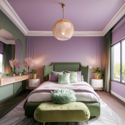
Lavender and Vitality Green- 3564 make a refreshing and serene duo that radiates a sense of calm and relaxation. Lavender's soft, floral undertones blend beautifully with the cool freshness of mint green, creating a delicate yet vibrant palette.
Where to Use This Palette:
- Bedroom: Lavender walls with mint green bedding create a tranquil sanctuary perfect for relaxation.
- Kitchen: Mint green cabinets paired with lavender accessories add a playful, vintage-inspired charm
- Home Office: Boost concentration and creativity with lavender accents against mint green walls.
4. Peach and Soft Gray
A palette of peach and soft barley- 2673 offers a sophisticated yet warm ambiance. Peach brings a touch of warmth and cheerfulness, while soft grey adds an understated elegance, balancing the vibrancy.
Where to Use This Palette:
- Living Room: Soft grey walls with peach accents—like cushions, rugs, or artwork—create a refined, cozy space
- Dining Room: Peach-coloured chairs against a soft grey backdrop enhance the dining experience with a welcoming glow.
- Entryway: Make a stylish first impression with peach accents against light grey walls
5. Pale Yellow and Sky Blue
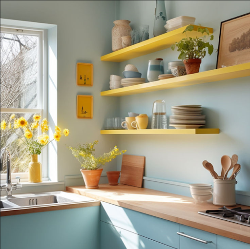
If you want to infuse positivity and energy into your home, go for pale yellow and sky blue. This cheerful palette brings sunlight indoors while maintaining a serene, balanced vibe
Where to Use This Palette:
- Kitchen: Pale yellow cabinets with sky blue walls evoke a lively, welcoming atmosphere perfect for family gatherings.
- Kids’ Room: This fun and playful combination stimulates creativity and happiness.
- Balcony: Sky blue walls with pale yellow accents enhance natural light, creating a bright, uplifting space
Tips for Using Pastel Colours Effectively
- Balance is Key: Pair pastels with neutral shades like white, beige, or light grey to avoid an overly sweet look.
- Textures Matter: Mix different textures, such as soft fabrics, matte walls, and glossy accents, to add depth and interest.
- Natural Light: Pastel colours reflect natural light beautifully, making rooms appear brighter and more spacious.
Conclusion
Pastel shades are versatile, timeless, and perfect for crafting spaces that radiate calmness, joy, and sophistication. Whether you prefer a romantic blush and sage combination or a cheerful pale yellow and sky blue duo, pastels allow you to express your personality with subtle elegance.
Ready to transform your home? Explore the beautiful world of pastels with JSW Paints and let your space reflect your unique style and taste